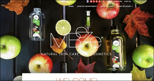
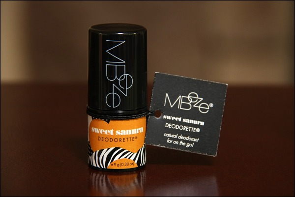
It's always exciting to launch a new website, isn't it? Everything is fresh and new. Rather than the “new car smell,” you can sense the “new website smell” coming right through your screen, right? We smelled it last week when our member, Mary Beth Worzella of Mbeze in Wausau, Wisconsin, launched a gorgeous new site that is a stunning representation of her brand. Here is a screen shot of the home page of the site, which runs on Shopify.

To describe it as “eye catching” would be an understatement, don't you agree? We asked Mary Beth to share a bit of her launch journey to give you some ideas about how you might approach a site launch and all of the details associated with it. Here is a bit of what she shared.
IBN: What e-commerce platform did you choose and why?
Mary Beth:
This is interesting, and shows how fast things change when it comes to technology.
When I decided to update my site months ago, I looked into Shopify and they were not a good option for my brand. But after listening to the Indie Business Network Success Call on website development a few months ago, I decided to check them out again and was really surprised at what I found.
They offer more competitive plans now, and and all the bells and whistles. Today, as opposed to a year ago, they have what I need to attract and service a more professional and serious clientele. I'm actually going to save money every month by switching over to Shopify.
Additionally, the Shopify development team adds new features all the time, so I automatically stay current because they are doing all the work for me.
Technology changes so fast now. It's important that you are not stuck with a website that cannot move you and your brand forward, or one that forces you to keep spending a ton of money to add new features as you grow. With my old site, I was stuck. I am not stuck anymore.
IBN: What is the logic behind such a huge, non-clickable image of products on the home page?
Mary Beth:
Bigger images was one of the main goals in getting a new look to my site. On my old site developed in 2008, the images on the home page were small but clickable, which was the norm back then. Today, big and juicy product photos attract people … and I like big images too. The image at the top is the header. It isn't clickable itself, but the navigation, logo, social sharing, etc., within it are.

IBN: What do you recommend for other Makers who want to launch a beautiful site on a tight budget?
Mary Beth:
If you have the skill set to design your own site, purchase a theme that appeals to you, and get started. But before you buy the theme and/or switch platforms, make sure you are capable of doing what you need design-wise and development-wise. You may need to hire a professional for a few things, but if you have design skills, buying a theme and tweaking it is probably the best way to go.
Many platforms and themes offer a trial period before you buy, so you can find out if it's something you can tackle on your own.
If you do not have the skills, by all means, don't try to do it yourself. Ask a developer or designer how much it would cost to just update your home page or your header to give your home page a fresh look without having to make an investment in a complete new design. Save your money so you can hire someone down the road.
Your product photos and images are so beautiful, what are your tips for creating such gorgeous images?
Mary Beth:
Practice taking and editing your own photos and creating your own images. I started to do this myself this summer, and it has helped me freshen up my brand big time. It's very time consuming to set up shots, get props, wait for the perfect lighting or set up your own, but if you have the desire to do it yourself and you want to develop your creative skills, it could be well worth it.
Besides shooting lifestyle images for my brand, I'll be re-shooting all of my product shots soon too. These days, you don't need an expensive camera or Photoshop to take your own pictures. Some of the latest smartphones have amazing cameras, and you can use free online photo editing tools, such as Pixlr, Gimp and several others to create and edit your images.
If you don't have the desire or time to do it on your own, make sure you review product photographer and designer portfolios before hiring someone. Are you impressed by what you see? Do they have a creative style that's similar to your taste? If not, keep looking. A new website is only as good as the content you put on it, so make sure you can achieve the look and features you want before going down the road of revitalizing your website.
Aren't those some great tips?
Learn more about Mbeze
Check out Mbeze's new virtual home here, and check her out on Facebook, Twitter and Instagram.


